Redesigning hospital workflows for speed and clarity
Doctors lack time to consider software, yet many EMR systems impose complex workflows during critical decision-making. This project aimed to redesign a hospital management system to lessen cognitive load and promote quicker, clearer actions in daily operations.
WHY THIS PROJECT MATTERED?
I grew up with a doctor in my family. I watched long days, shifting between patients while juggling screens and menus that slowed them down. That’s why workflow clarity isn’t abstract to me, it’s real.
THE REAL PROBLEM
Through analysis of existing systems and workflows, I identified key issues:
• Tasks required navigating multiple disconnected screens
• Critical information was not visible at decision points
• High cognitive load during repetitive actions
• No clear prioritization of patient data
This created friction in moments where speed and clarity are essential.
KEY DESIGN DECISIONS
Through reviewing existing systems and speaking with medical professionals, one pattern became clear:
Doctors rarely read screens carefully.
They scan quickly while multitasking.
This means the interface must prioritize:
• clear visual hierarchy
• immediate access to critical data
• predictable navigation
Designing for this context requires reducing friction in everyday tasks.
DESIGN APPROACH
The redesign focused on simplifying workflows and making patient information easier to access.
Key design principles included:
Prioritize critical information
Important patient data should be immediately visible.
Reduce navigation steps
Doctors should reach key sections with minimal interaction.
Create consistent structure
Layouts and navigation patterns should remain predictable across the system.
Lower cognitive load
Visual hierarchy should help users scan information quickly.

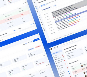
KEY SCREENS
Doctors orient within seconds instead of scanning the entire screen
DASHBOARD
Before: Before, doctors logged in and scanned for context — like waking up without coffee. After, the dashboard orients them instantly — urgent tasks first, today’s schedule second, so they’re ready before they start.
After:
A focused operational control center:
• Today’s patients first
• Urgent alerts highlighted
• Quick actions visible without digging
• Customizable modules


PATIENT RECORDS
Critical information now surfaces immediately.
Secondary data supports — not competes.
Before: Hard to scan, no hierarchy
After:
Changes included:
• Structured history sections
• Clear medication hierarchy
• Labs grouped by clinical relevance
• Reduced visual density
• Strong typographic contrast
Why it matters: Critical patient info is accessible instantly — reducing risk and saving time.


SCHEDULE MANAGMENT
Before: Disconnected tools + friction
After: Calendar design with quick actions and conflict alerts
Improvements:
• Faster appointment edits
• Clear conflict indicators
• Reduced menu depth
• Simplified transitions between patients
Why it matters: Fewer mis bookings, smoother collaboration, optimized resource use.

REPORTS
Before: Overwhelming data dumps
After: Charts and summaries with filters
Why it matters: Teams can see trends and act, not just stare at tables

DESIGN IMPROVMENT
The redesigned interface introduces several improvements:
• clearer information hierarchy
• improved grouping of related data
• simplified navigation between patient records
• better visibility of critical medical information
These changes aim to make the system easier to navigate in fast-paced medical environments.
ESTIMATED IMPACT
Although this was a concept redesign, usability improvements suggest the following potential outcomes:
• ~30% fewer workflow steps for common tasks
• faster access to patient data
• reduced cognitive load when scanning complex information
• improved clarity across key workflows
REFLECTION
Designing for healthcare systems highlights how critical clarity and speed are in complex environments.
Small improvements in interface structure can significantly affect how professionals interact with data during high-pressure situations.