WHY THIS MATTERS?
Moving to a new neighborhood as a young adult can feel isolating.
You don’t know the cafés.
You don’t know the events.
You don’t know the people.
Most platforms show places.
Few help you feel connected.
MyHood started with a simple question:
How might we make discovering local communities feel less overwhelming and more human?
THE REAL USER PROBLEM
Young adults exploring a new area face subtle friction
• Too many options, no clear entry point
• Social anxiety around showing up alone
• Difficulty identifying events that feel relevant
• Lack of trust in unknown communities
Discovery wasn’t the issue.
Belonging was.
Users weren’t just looking for information.
They were looking for confidence.
UNDERSTANDING THE USER
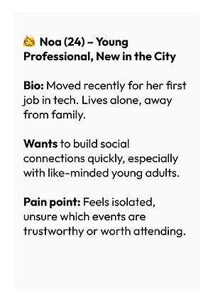
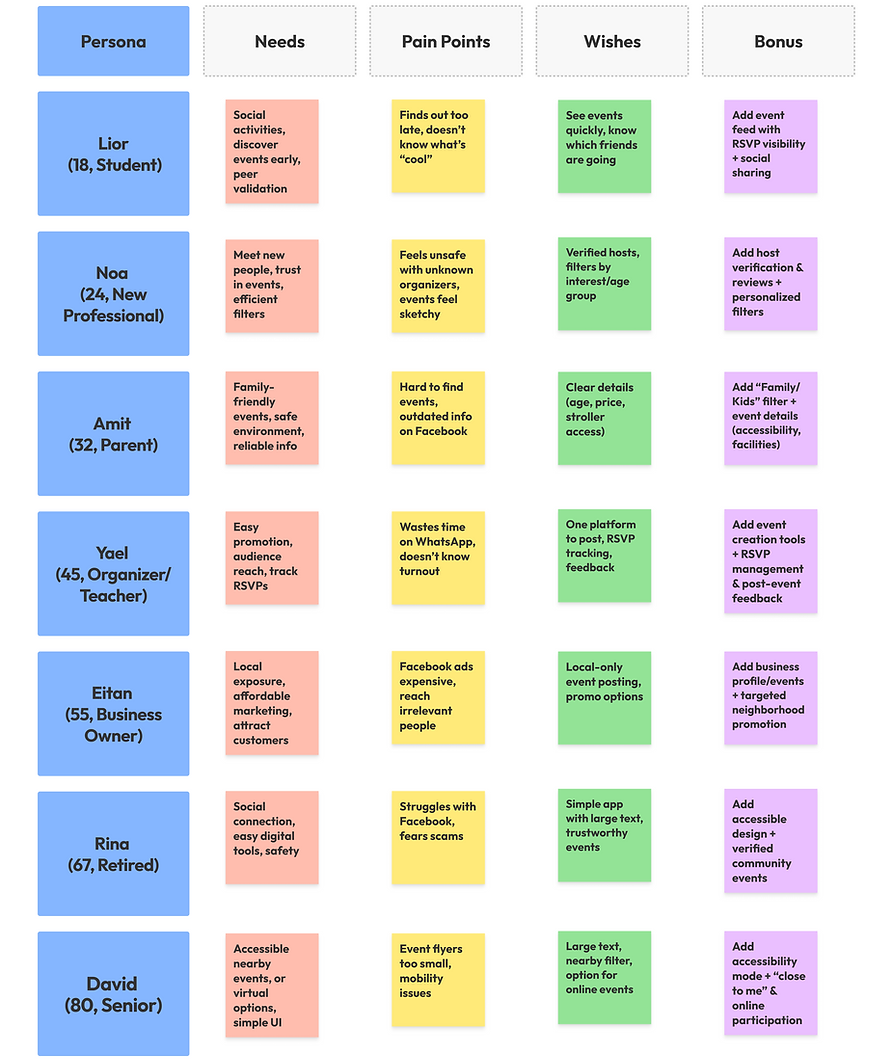
I focused on young adults aged 22–30
• Recently moved for work or study
• Curious but hesitant
• Digitally comfortable but socially cautious
• Looking for shared-interest communities
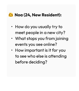
Through research and behavioral mapping, one insight stood out:
People don’t explore neighborhoods randomly.
They explore through identity.
“Am I a runner?”
“Am I into art?”
“Am I trying to meet entrepreneurs?”
Discovery is identity-driven.
That shaped the entire product direction.






Final
Design

🏘️Home Screen
Greets users with a personalized message, providing safety, bomb shelter locations, and quick access to options like Events.
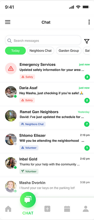
💬 Chat
Facilitates private one-on-one interactions with recent chat history real-time messaging, and options for text, images, or quick replies, prioritizing events.

🙊 Full Conversation
When a user selects a conversation from the messages screen, a full-screen view appears, showcasing all the details.

📆 Events
A curated collection of local events with key details like date, time, location, and a brief description. Users can browse event information and RSVP directly from the interface.

🎫 Full Event
When a user selects an event from the feed, they see a full-screen view of all details, including:
- Sticky RSVP for easy responses,
- Verified host credibility,
- Attendee preview,
- One-tap Calendar/Share options.

🆕 Add New Post
This screen allows community posts. Quickly publish with optional settings.

🖌️ Edit New Post
This screen allows users to update or revise an existing post they’ve previously shared.
The interface provides a familiar posting experience, focused on efficient and minimal editing.
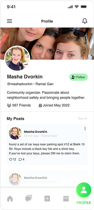
💁 User Profile
This screen displays a user's profile with personal details, community activity, safety preferences, and emergency contacts.

✂️ Edit Profile
User profile view showcases personal details and activity. The layout is clean and intuitive, focusing on personal expression.
Final
Thoughts
🤓Reflections
This project gave me the opportunity to rethink how digital products can strengthen real-life communities. Although a self-initiated redesign, it sharpened my skills in information architecture, visual hierarchy, and engagement design.
If I were to take the project further, I’d test the redesign with real community members to validate feature prioritization and improve relevance for different types of users.
🧐 Key Design Improvements
-
Simplified navigation into 3 core areas: Community, Events, Services.
-
Redesigned dashboard delivering personalized updates, local alerts, and event previews at a glance.
-
Built trust visually using approachable colors, clear hierarchy, and a human tone.
-
Encouraged real interaction through RSVP actions, polls, reporting tools, and safety updates.
-
Reduced feature noise to support accessibility for all ages (especially older residents).
🧠 User & Community Impact
-
Increased sense of digital safety, clarity, and belonging.
-
Created a space where community members felt comfortable returning to.
-
Transformed neighborhood engagement from passive scrolling → active participation.
-
Designed for collective benefit, not just content consumption.
⏭️ Next Steps
-
Validate feature prioritization with real neighborhood communities.
-
Add verified moderator roles to increase trust perception.
-
Expand engagement with local partnerships (neighborhood orgs, local businesses).
-
Introduce optional group channels (pets, parents, events, sharing, etc.).
